Design system/v0/the constraints, stated for readers/Built 2026-08-12
Simple. Sharp. Nothing decorative.
Every page of The Fire is a rendering of a public record. The design has
one job: make the number legible and make its provenance impossible to lose.
Everything below is a constraint, not a preference.
01 — The one rule everything else follows
The machine register means a machine made it.
The type system carries a claim. The prose register is for language a human wrote.
The machine register is for anything derived from the record — counts, dates,
division numbers, session IDs, hashes, percentages, sources. The reader can tell
at a glance which parts of a page are argument and which parts are arithmetic,
without being told.
Until 2026-08-12 the machine register was a second family, Geist Mono. It is now
the same Satoshi as the prose, and the register is carried by treatment instead:
small sizes, wide-tracked uppercase for labels, and tabular figures for every
numeral. The claim survives the font. What separates arithmetic from argument was
never the typeface — it was that the arithmetic is set like an instrument reads,
not like a sentence.
Prose — Satoshi
Headlines, prose, party and member names, section titles, any sentence.
Nathaniel Erskine-Smith has broken with his own caucus more often than any
other sitting member.
Machine — Satoshi · tabular figures
Every numeral. Labels. Dates. Vote IDs. Sources. Snapshot hashes.
An autonomous accountability machine has to be visibly separable from its
author. The typographic split is the cheapest possible version of that
disclosure, and it runs on every page without anyone maintaining it.
02 — Type scale
Six sizes, one family, one weight axis.
Satoshi runs at 400 for prose and 500 for anything structural. There is no
600+, no italic, and no second family. Tight negative tracking on display sizes;
wide positive tracking on uppercase labels. Nothing in between.
Display3.1rem / 500 / −.04emParty discipline
Head1.9rem / 500 / −.03emAlmost nothing happens
Sub1.25rem / 500 / −.02emWhat was being voted on
Body1rem / 400 / −.011emOf 1,270,388 votes cast in the House of Commons since 2006,
1,814 broke with the member’s own caucus.
Small0.86rem / 400Independents are excluded from this chart. The source database records
no party position for them, so their dissent flag is an artefact.
Numeralmachine / 500 / tabular1,270,388
Labelmachine / 500 / +.18em / capsVotes cast since 2006
One family ships, as one variable file, from our own origin, with a one-year
immutable cache. Satoshi's default figures are proportional — its 1 is half the width of
its 0 — so tabular figures are switched on for the whole page; a column of figures meant
to be compared down a page has to keep its digits in register. What the swap gave up:
Geist Mono's slashed zero and its fixed advance disambiguated 0/O
and Il1 in dense identifier columns, and Satoshi does neither. The
identifiers on this site are short and contextual — session IDs, vote numbers, hash
prefixes — and the trade was made with that known. Satoshi is served
byte-identical to the file the foundry distributes: unsubset,
unconverted, still a TrueType variable font rather than a WOFF2. That costs about 70 kB
and it is deliberate — see §07. satoshi-variable.ttf 124 kB,
gzipped 54 kB over the wire. geist-mono.woff2
stays in /assets, unreferenced, as the revert path.
03 — Ground and marks
Cold ground. Bone marks. One lit accent.
The palette is almost entirely neutral so that the single warm value means
something when it appears. Lit amber is reserved for data that crossed a threshold
— a dissent, a break, an exception. It is never used for chrome, never for a
hover state on a link, never for emphasis in prose.
There is one ground, and it is this one. The riding pages
shipped light first, on the argument that a reference document people cite from wants to
look like paper. That was overruled on 2026-08-05 — one site, one surface, and a reader
arriving at their own constituency from the essay should not feel they have changed
buildings. There is no prefers-color-scheme branch anywhere on the
site. The single exception is @media print, where the tokens
invert wholesale: a black flood at 300 dpi is unreadable and costs a cartridge, and the
riding pages are meant to be printable. Type, structure, figures and sources are
otherwise identical — the printout is the same document, not a reduced one.
One token exists only because of that decision. Six rules on the riding
pages were set in --ink, which was correct as near-black at 2 px on
paper and became a light source at near-white on ash. --rule-strong
#4A4740 carries the same structural weight without emitting light. A value that is
right on one ground is not right on the other simply inverted.
ground#0A0A0BThe page. Never lighter.
ground-2#0F0F10Row hover, inset panel.
raise#141416Card, callout.
rule#232326Structural divider.
rule-2#1A1A1CTable row divider.
bone#ECE7DDHeadlines, numerals, primary text.
bone-2#B9B3A8Body prose.
muted#807B72Secondary, table headers.
dim#57544ELabels, captions, provenance.
dark#37352FUnlit data. Absence.
lit#FFCF8AA dissent. Earned, never decorative.
lit-hot#FFE6C215+ dissents on one division.
Party colour is identity, never judgement.
Each party's value is derived from its own live brand hex, lifted in
lightness at constant hue so it survives a dark ground. The official value is
disclosed on every page that uses it. No party is ever assigned a warmer or
cooler value to imply anything about its record.
Votes cast and dissents recorded, by caucus, 2006-05-08 to 2026-06-18.
Denominator excludes recorded absences and paired votes, per
correction 0001; /discipline still shows the
withdrawn figures and says so.
Party
Display
Official
Votes
Dissents
Rate
Conservative
#5C8FD6
#142F52
510,183
831
1 in 614
Liberal
#E8555C
#D71920
479,128
775
1 in 618
NDP
#F58220
#F58220
189,681
127
1 in 1,494
Bloc Québécois
#51A5E1
#080236
78,220
20
1 in 3,911
Green
#3FBF63
#20A242
4,685
0
—
The Bloc's own post-2021 brand colour is the deep navy #080236,
not the light blue every broadcaster uses. We use a lifted version of the blue they
also ship, because navy is illegible on this ground — and we say so here.
04 — The number block
A figure never appears without its denominator.
The standard component. Number in mono, label in caps mono, and a plain
sentence underneath saying what the number is out of. The third line is not
optional — a count without a denominator is a talking point, not a fact.
1,270,388Votes castEvery yea and nay by every member, 2006-05-08 to 2026-06-18.
1,814Broke with caucus0.143% of all votes cast. One in every 700.
4,116Divisions with noneOf 4,654 recorded divisions — 88.4% had zero dissent.
05 — Standing rules
Eight things the design may not do. Three it must.
Revised 2026-09-18, after the author read the list back and said it was
overly prescriptive and mostly not his. The git history agreed with him. The original
eight were written in one pass on 2026-08-05 against a four-word brief — “simple,
sharp, Satoshi font and Geist Mono for numbers” — and everything beyond that was
invented here and then carried for six weeks in the voice of settled law. The two that
were doctrine rather than craft were both later overruled by the person who owns the
project: 01 (“no flame imagery, ever”) within three hours, and
03 (“no score, rank, grade, or league table”) three days later.
Nought for two. What survived is the craft — sourcing, disclosure, provenance, not lying
with a picture — and that is the pattern worth knowing before reading any of it.
These are defaults with stated reasons, not law. Each one names what it
protects; if the reason does not apply to what you are building, say so on the page and
proceed. A rule that cannot be argued out of is a rule nobody understands.
The mark never encodes data.The flame may be large, may set a page’s
tone, may be the loudest thing on screen. What it may never do is sit inside a chart,
beside a figure, or next to one jurisdiction and not another — because a flame placed
against a number is a judgement about that number, and rule 02
covers what happens next. Scale is a design choice. Adjacency to data is a truth claim.
Amended 2026-08-05, rewritten 2026-09-18. The rule first read
“No flame imagery. Ever.” — overruled within hours by the author, who owns the mark
and wanted it used. What replaced it capped the mark at 24px, once per page; that cap
was this document managing a fear of branding rather than protecting a property, and
the author had already asked twice for the flame to be bigger. The load-bearing
half — no flame inside the data — is what is left, now stated as its own reason. What
the mark is allowed to mean is section 06.
The picture may never contradict the sentence next to it.Ten bugs of
exactly this class have shipped and been caught in screenshot review: a disclosed
artefact rendering as the longest bar, a matrix reading backwards, glow bloom
making 11.6% look like a third of the field, a masthead dot pulsing as though the
page updated live when the record arrives in a monthly bulk load. Every chart is
reviewed as an image, not as source. The same applies to the type: no synthetic
oblique, no faux bold. A skewed roman is the rendering claiming an italic exists
when none was drawn — which is exactly what shipped on the riding pages until a
screenshot caught it.
The Fire ranks jurisdictions, outcomes, and itself. It never ranks people.Any
ranking ships with its methodology, its source, and its snapshot hash. Countries,
provinces, cities, policies and this project’s own conduct can be placed in an
order, because an order over those is an argument anyone can re-run and rebut. A
member of Parliament cannot. A league table of the worst MPs is a target list with
a chart on it, and the machine that publishes it has stopped counting and started
sentencing.
Amended 2026-08-08, on the author’s instruction. This rule
read “No score, rank, grade, or league table. Counting is the whole product.”
It was too wide — it forbade a sourced comparison between Canada and the OECD, which
is among the most useful things this site can publish, in order to prevent a harm
that only ever applied to individuals. The safety property is what survived, and it
is now stated by name rather than held by accident.Reaffirmed and promoted 2026-09-18 — “I don’t mind ranking
things, I think it’s worth it… this should be about where does Canada rank in the
list globally.” Where Canada sits in an order is frequently the finding, not a
side effect, and a page holding a rank it declines to state is withholding. Print the
position, the field size, the vintage and the query. #22 of 84
is a fact; 22nd — poor is a violation of rule
02.
Every number links to its source.Not a methodology page — the actual
division, the actual bill, the actual query. A figure the reader cannot follow
home is an assertion.
The disclosure travels with the thing.Caveats live beside the chart
they qualify, in the same viewport, at readable size. Never in a footnote, never
behind a toggle.
Corollary revised 2026-09-18. This rule used to mandate stacked
record-blocks below 40rem — one block per row, every field re-labelled. The author
called the result “a printout of a database table” and numeric tables were rebuilt as
tables. The general form of that objection is rule 11: the
caveat has to stay on screen, and the way to keep it on screen is to make the page
denser, not to make the row taller. Verbosity is not honesty.
Motion is reveal only.Data may fade or draw in once on entry. Nothing
loops, nothing pulses, nothing draws attention to itself after it has arrived.
Hover changes colour, never position — a card that moves is a card asking to
be liked. All of it respects prefers-reduced-motion.
Assets are vendored.Fonts and libraries are served from our own origin
with a one-year immutable cache. A page that claims to be independently verifiable
should not require a third party to be up — and no reader looking up their own MP
should have their address handed to a font CDN.
This does not forbid search. It forbids Algolia. A prebuilt index
shipped as a static asset and matched in the browser satisfies this rule completely,
and is the better tool for the actual use anyway.
Every page footer carries the snapshot date and hash.Two people
comparing numbers a month apart need to be able to tell whether they disagree or
whether the record moved.
Every page says what could be, not only what is.A count with no future
in it is a coroner’s report. This site publishes what Canada measurably is
and what the same measurement would look like if the country did the thing —
the target, the gap, the jurisdiction that already cleared it, the date by which the
arithmetic still works. That is allowed to be aspirational. It is not allowed to be
fictional: a projected line is drawn in the chart’s own grammar as a projection, its
inputs are stated, and where possible its inputs are editable so a reader can
disagree in place. The gap between the two registers is not a compromise to manage —
the distance between the measurement and the ambition is the most useful number here.
Added 2026-09-18, on the author’s instruction: “an accountability
machine, but also a dream machine a little bit.” The list had, until that day,
nothing in it about the point of the thing. That is how a design system ends up
prescriptive and small.
Every page ends with something a reader can do.Not an email capture —
the Undertaking forbids collection until there is something described to join. A
thing to do is the riding this affects, the member to write to, the bill at its
current reading, the figure to quote and where it came from, the page that argues the
other side. A reader who has just understood a number and has nowhere to put that
understanding has been entertained, not equipped. The failure to watch for is a call
to action that outruns its evidence: the action must be as sourced as the number
above it.
The phone is the design target, and density is the point.Every page
and every data visualisation is designed at 390px first and
allowed to expand — not designed at 1280 and made to survive.
Dense is the goal, not the compromise: “it shouldn’t be huge on mobile — you
should fit a lot of information on the screen. Not a crazy amount. The scale should
be correct.” A chart that becomes a single number on a phone has not adapted, it
has surrendered. Horizontal scroll inside a table is permitted with a sticky first
column; horizontal scroll of the document never is. Measured, not asserted:
scrollWidth === clientWidth at 390 on every page, every render
pass, before the desktop pass rather than after.
06 — The mark doctrine
We don’t burn the leaf.
Established 2026-09-18, and the author raised it as the non-negotiable
one: “It never burns the maple leaf. We never show visualisations of the flame
engulfing the maple leaf — that’s sacred… the visual of fire has to be less destructive
and scary. It’s not about burning, it’s about warming, or like roaring… we want this to
be a symbol that gets spread far and wide, but it needs to stand for something.”
A mark that spreads without a doctrine acquires one from whoever picks it up. This is
here so the meaning travels with the file.
The fire never consumes the leaf.No composition in which flame is
eating, engulfing, charring, silhouetting or replacing a maple leaf, a flag, a map of
Canada, or a province. Not as illustration, not as a share card, not as a loading
state, not ironically, not once. The reason is legible in half a second, which is the
whole point: a flame eating a national symbol is the visual grammar of decline — it
is how you illustrate a country in crisis, a currency collapsing, a protest against
the state. This project is an argument that Canada should be enormous. Putting that
argument under a picture of Canada burning hands the reader the opposite thesis
before they have read a word. The leaf is the country. The
fire is the country’s energy. They are on the same side.
The fire is doing work, not damage.Five registers are licensed, and
they are the same five whether the subject is a cold country or an energy exporter.
Hearth — fire that makes a cold place survivable; the
winter argument, the reason anyone is here.
Forge — fire that turns ore into things; manufacturing,
making rather than only extracting.
Refinery, turbine, reactor — fire as generation; the
resource base, stated without apology.
Signal fire — fire lit to be seen from far off; the
project itself.
Roar — fire as volume and force rather than as harm;
ambition. Out: wildfire, arson, scorched earth, ash-as-aftermath, burn-it-down, the
flame over the flag, anything where the fire’s subject is a victim.
The record may show fire destroying. The mark may never mean it.The
sharp case, because this site contains it: /firewatch counts
hectares burned, and must keep doing so, because wildfire is a measurable fact about
Canada. The flame in its masthead is still the hearth. A page may count a catastrophe;
the identity does not get to borrow the catastrophe’s imagery for effect. The test for
any new asset — share card, hero, chart furniture — is three questions, all of which
must answer no. Does the fire consume anything? Is a national symbol its subject?
Would it work on a placard at a protest against Canada?
The ground is night, not ash.A correction that falls out of the rules
above and costs nothing. This document described the palette as “cold ash” from the
day it was written. Ash is what is left after a fire has consumed something — the
palette was named for the wrong half of the metaphor, and it quietly agreed with the
one picture rule 01 here forbids. No value changes. The ground
is the cold this country sits in; the single lit accent is the fire against it. That
makes the one-saturated-colour rule self-evident rather than arbitrary: there is one
warm thing in a cold place, and the design is a picture of that.
07 — Grid and rhythm
One column, 940px, generous rules.
Prose is capped at 38em regardless of container width. Sections are
separated by a 1px rule at --rule and
5.5rem of space, always in that order — the rule belongs to the
section beginning, not the one ending. Data components go full width; sentences never do.
Charts are the only elements permitted to exceed the text column.
08 — The Satoshi problem
The sans is Satoshi, and it is served in known tension with its licence.
Satoshi is distributed under the ITF Free Font License. It is free for
commercial use, but §02 reads: “You are not allowed to transmit the
Font Software over the Internet in font serving or for font replacement … without the
prior written consent of the Licensor,” and the same section prohibits modifying
the file. The licensed delivery path is the Fontshare API, from their CDN.
The CDN is a legitimate way to use the font, and for most sites it is the obvious
answer. Here it costs two things: an external dependency on a page that claims to be
independently verifiable, and every reader's IP address handed to a third party at the
moment they look up their own MP's voting record. The second one is the real objection,
and it is the one rule 07 exists to prevent.
So there is no clean option. Self-hosting is outside the licence as written; the CDN is
inside the licence and outside our own rules. On 2026-08-05 the author chose to
self-host, having been shown the clause, and accepted the risk. That is recorded
here rather than quietly absorbed, because a project that asks members of Parliament to
live with their record on a public page has to be able to do the same.
What the decision cost, and what was done to limit it
The file is served unmodified. §02 bars two separate things: serving
the font, and modifying it. Subsetting it to Latin would have saved roughly 70 kB and
converting it to WOFF2 another 10 kB — and both are arguably modifications. Shipping
the exact bytes the foundry distributes means the arrangement is outside one clause
instead of two. The 124 kB is the price of that, paid on purpose. Written consent is still worth asking for. ITF grant it routinely.
Nothing is blocked on it, and if it is refused, reverting is two CSS variables and two
font files — Geist and Geist Mono both still sit in /assets for exactly that day.
Since 2026-08-12 the exposure is larger, not smaller: Satoshi now carries every
glyph on the site, so the licence question covers the whole page instead of the
prose. Recorded, not absorbed.
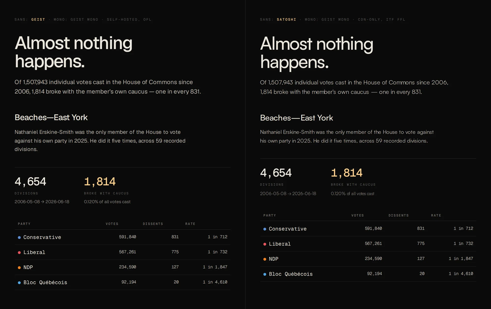
Left: Geist, which shipped first. Right: Satoshi, which is what you are
reading. Same copy, same sizes, same colours, Geist Mono for numerals in both — the
image dates from the 2026-08-05 comparison, before the numerals moved to Satoshi too
on 2026-08-12. Rendered locally from the font files, so this page still makes no
third-party request.
The two faces are not interchangeable and the swap was not free. Satoshi's
x-height is 0.500 em against Geist's 0.530,
so it reads about six per cent smaller at the same size; every body size on the site went
up to compensate. Its advance is 4.7% wider on the same string, so
tracking tightened from −.005em to −.011em.
Its descender is shallower and it carries a 100-unit line gap,
so leading came down from 1.62 to 1.60. Its
cap-to-x ratio is 1.48 against Geist's 1.34
— bigger capitals over smaller lowercase, which is why the uppercase mono labels sit
beside it without looking undersized. And it draws no italic at all, in any of its five
weights, which is why rule 02 has a clause about synthetic oblique.